
Brand Guidelines
A brand identity goes beyond visual style—it's the cornerstone of how a brand communicates and connects with its audience.
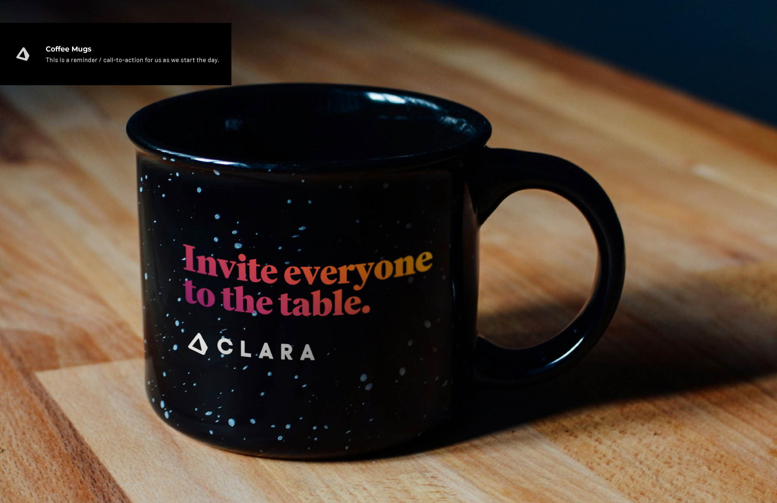
For CLARA, our brand identity guidelines are designed to ensure clarity, consistency, and emotional resonance across all touchpoints. These guidelines serve as a blueprint for expressing CLARA's commitment to equitable AI-driven hiring, ensuring that every interaction reflects the brand’s attributes of empowerment, community, and thoughtfulness.
Attributes
Brand perception is shaped by consistent encounters over time. The attributes we define act as a rigorous checklist, ensuring uniformity in how the brand is experienced and remembered.
The attributes are categorized within the building blocks of trust: visuals, warmth, and competence.
Visuals
Empowering
Our visuals will empower, tell stories, and inspire those who come in contact with the brand.
Competence
Thoughtful
People can trust that every part of the brand is thoughtful through its strategic, informed, and intentional actions.
Warmth
Community
Warmth will be showcased through a tone of voice that cultivates an environment that welcomes, uplifts, and celebrates people.
Logo
Our Prism
Logo Options
Seeing People
A prism illuminates the spectrum of colors in light.
Just like CLARA illuminates the multifaceted characteristics in candidates.
Equitable
When light passes through a prism, it reveals vibrant colors that were not visible before.
CLARA acts as a prism in a vast field of candidates that reveals the capabilities of the overlooked and underestimated to inclusively find an incredible fit for a role.
Safe Zone
Clarity and recognition is achieved by ensuring spacing around the logo remains uncluttered.
The logo's safe zone is equivalent to the "C" on all sides.
Social Media Profile Images
Prism Icon because the word CLARA will typically be present next to it.

Notes
In Copy
When typing “CLARA,” put in all capital letters for ultra clarity.
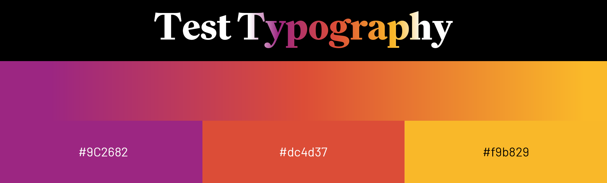
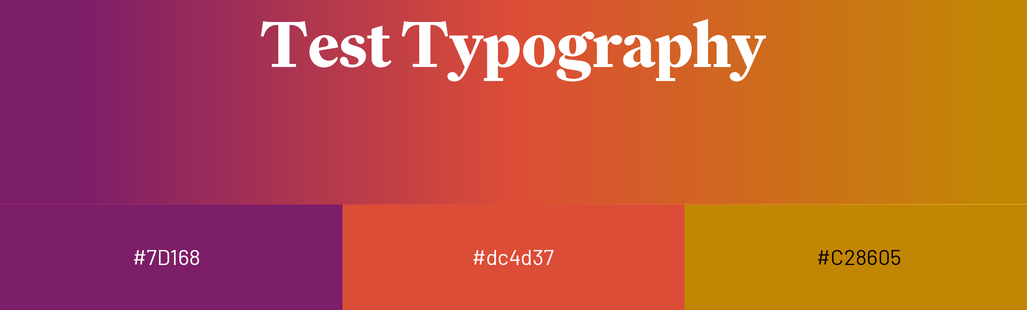
Typography
These strategic selections of fonts are not merely stylistic choices but are foundational elements that enhance our communication and embody our attributes.
The boldness of Family empowers each of our voices in headlines, while Degular's modernity fosters a sense of community in the subheads, and Barlow’s clarity and approachability in the body convey thoughtfulness, aligning each typeface with CLARA’s core attributes of empowerment, community, and thoughtfulness.
Primary Typography
Headline: Family
Weight: Heavy • Leading: 1.5 • Tracking: 0
Subhead: Degular
Weight: Regular • Leading: 1.5 • Tracking: 0
Body: Barlow
Weight: Regular • Leading: 1.5 • Tracking: 0
Alternative Typography for when testing shows sans-serif performs better for digital marketing.
Headline: Degular Bold
Weight: Bold • Leading: 1.5 • Tracking: 0
Subhead: Degular
Weight: Regular • Leading: 1.5 • Tracking: 0
Body: Barlow
Weight: Regular • Leading: 1.5 • Tracking: 0
Color
This color shift reflects CLARA's mission to transform and democratize the hiring process, moving from traditional practices to a more inclusive and vibrant future.
For CLARA, our design philosophy harnesses the evocative power of color to reflect the core of our innovative tool. We selected a gradient that transitions from a deep, thoughtful purple to an energetic, optimistic orange. This color journey not only visually captivates but also metaphorically represents the transformative process CLARA facilitates in the hiring landscape.
Purple, traditionally associated with wisdom and dignity, signifies the deep intelligence and integrity of CLARA's AI algorithms. This choice underpins the tool's commitment to thoughtful and fair analysis of each candidate, respecting diversity and fostering inclusivity.
As the gradient flows into orange, it symbolizes a shift towards warmth, enthusiasm, and the human-centric approach of CLARA. Orange evokes a sense of creativity and sociability, echoing CLARA's goal to bring vibrancy and new perspectives into the workplace by championing equitable hiring practices.
This dynamic interplay of colors not only enriches the visual identity of CLARA but also reinforces the brand’s goal to innovate and democratize recruitment processes. The gradient, thus, is not merely aesthetic but a narrative element, encapsulating the journey from traditional constraints to a brighter, inclusive future.
Colors: Percentages
At CLARA, we emphasize the strategic use of primary and secondary colors to create a visually compelling narrative, ensuring each hue plays a distinct role in guiding the viewer's experience and enhancing the overall impact of the design.


Colors: Illustrations
These colors are intended for use in illustrations without the need for textual elements.
Colors: Gradient in Type on Black Background
Colors: Gradient Background with White Type
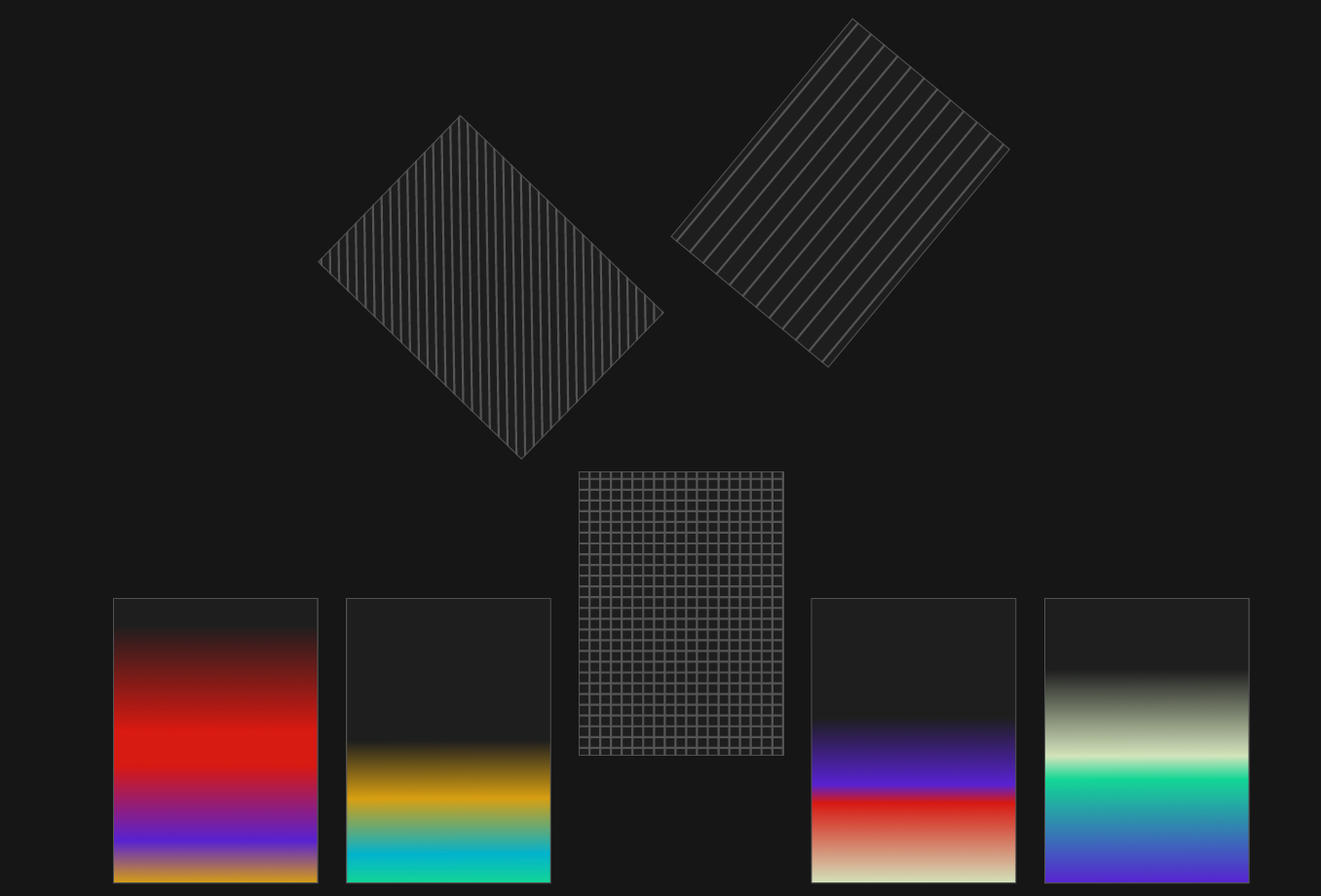
Patterns & Gradients
This tapestry of patterns and gradients represents the rich diversity and talents of the individual candidates.
Each pattern or gradient serves as a metaphor for their aptitudes and potential, making visible the often-invisible qualities that define a candidate's suitability for a role.
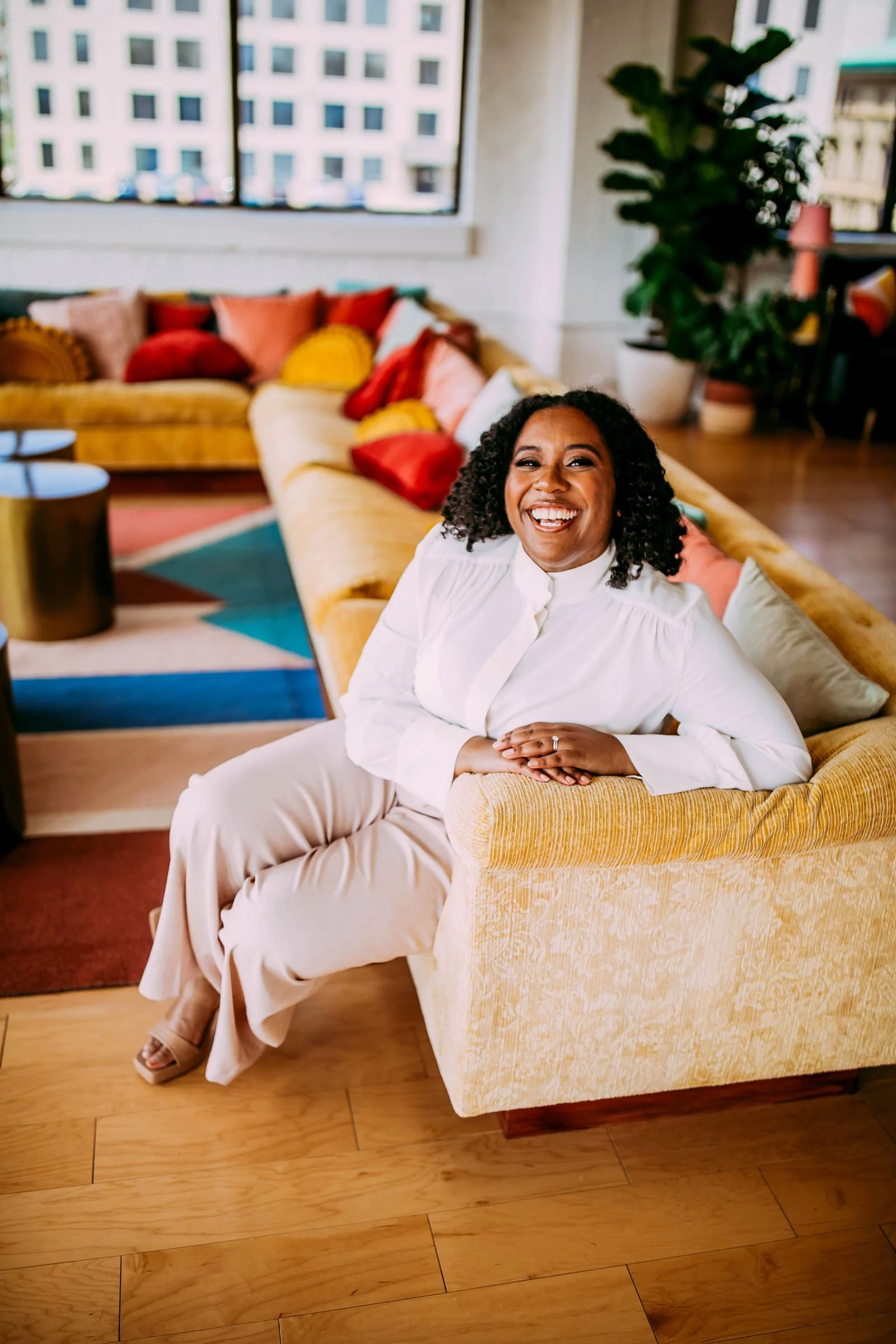
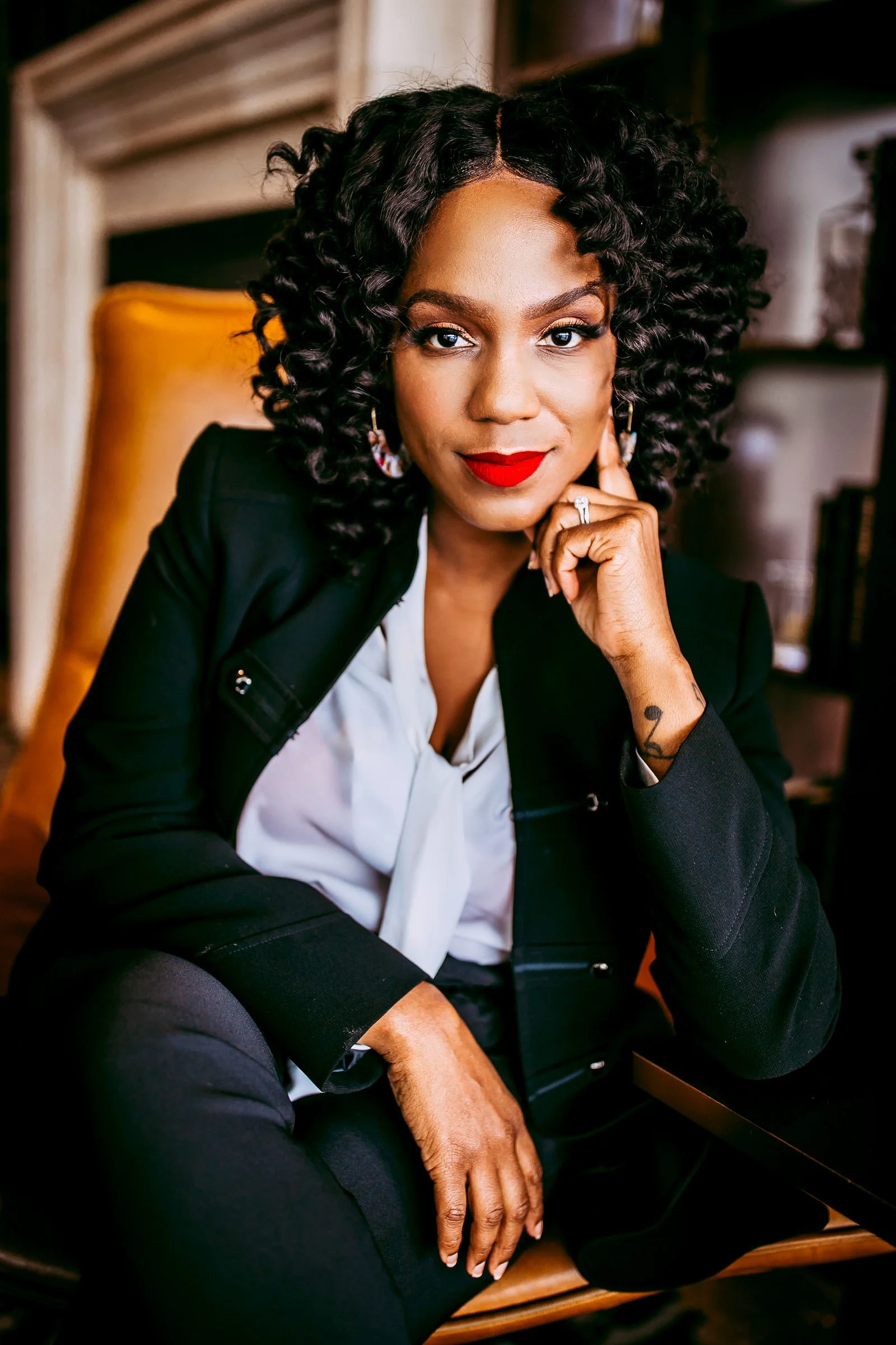
Photography
People
Vibrant, Rich Colors
The commonalities of people are represented by the vibrancy of the colors. The uniqueness of people is represented through the various vibrant colors in the backgrounds or clothes. All harmonizing with the brand and overall brand palette, ensuring a cohesive visual story.
People
Engaging
Individuals are poised, not passive; they are ready to engage, not merely be present. This visual approach supports the underlying philosophy of CLARA: to not only see the candidate but to understand them, to not just view a picture, but to foresee a possibility.


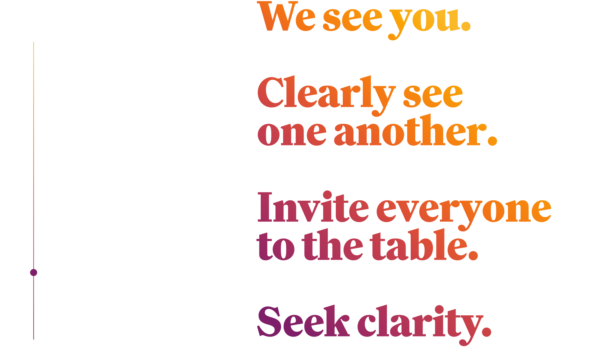
Tone of Voice
Overview
At CLARA, our voice is the bridge between our innovative technology and the diverse communities we serve. It reflects our expertise and humanity, making every interaction meaningful and empowering.
Our Tone
Clear & Empathetic
We communicate with clarity and understanding, making sure our messages resonate on a human level. Our words are carefully chosen to be accessible and supportive, reflecting our commitment to inclusivity.
Expert & Insightful
Our expertise is at the core of our voice. We speak with confidence, backed by data and experience, to inspire trust and credibility.
Innovative & Open
We're pioneers at heart, always in pursuit of better solutions. Our language is optimistic and forward-thinking, highlighting our willingness to explore new ideas and embrace change.
Genuine & Respectful
Our interactions are sincere and respectful, acknowledging the value and diversity of every individual. We celebrate our community with warmth and genuine appreciation.
General copy that is focused on a more altruistic view that anyone could get behind.

Pointed copy that is relevant to the product and outcome.
Expression Spectrum
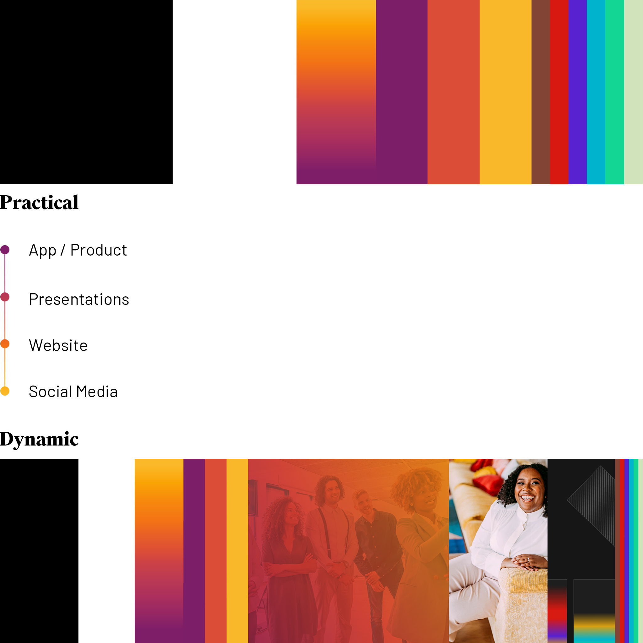
Samples